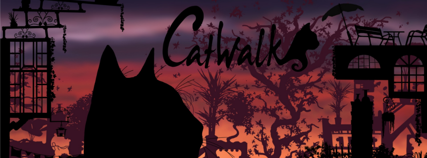
Catwalk is a side-scrolling jump ‘n’ run with a cat as protagonist and cut-out silhouette visual style.
Play Catwalk
You can choose a level from the menu, accessible at the beginning and through pressing Esc.
Catching mice is easier if you sneak up on them and jump out of a crouched position.
Controls:
Arrow keys left/right: Move left/right
Arrow key down: crouch
Space: Jump
If the cat clings to an object:
Arrow key up/arrow key in object direction: Climb up
Arrow key down/arrow key away from object: Let go
If you find a bug, please go ahead and report it through the comment system below or contact me.
[WP_UnityObject src=”http://www.martin-schmitz.com/wp-content/uploads/2013/08/CatWalk_WebPlayer_2013-08-20.unity3d” width=”725″ height=”544″/]
Screenshots
About CatWalk
Brief: Catwalk is a side-scrolling jump ‘n’ run with a cat as protagonist and cut-out silhouette visual style.
Outline: 4 students, 2 semesters, web based and stand-alone game with 4 levels using Unity 3D, done for university project courses
Time frame: March 2011 – February 2012
Tools I used:
- Unity 3D
- MonoDevelop
- SVN via TortoisSVN (early on)
- Mercurial via TortoiseHG (later)
- Dropbox
- BitBucket.com
- ScrumDo.com
- Skype
My direct responsibilities:
- Level Design:
- levels 2&3 of the 4 final levels,
- some preliminary levels not included in final build
- Scripting e.g.:
- the entire first prove-of-concept prototype (first 2 months)
- level loading and streaming
- jump pre-calculations using ray-casts
- profiling and optimization
- … etc
- GUI:
- Menu
- HUD
- game-pad compatibility
Team efforts
Apart from the things I was directly and solely responsible for, I worked on far more in collaboration with the team. Game Design was mostly Cordula’s and my responsibility, but every team member got to contribute with ideas and feedback on equal terms. This not only enabled us to find and evaluate new ideas faster and more in depth, but also helped to maintain our team spirit. Since Game Design elements like e.g. the possible moves, obstacles, rewards and incentives where dependent on their graphical representation, the animators and artists on the team needed to be included in the decision making process and provide their unique viewpoint to alert us of possible issues and challenges.
I also collaborated with my fellow Level Designer (Cordula) and our 2 Artists (Anja and Mandy) on finding the right settings. We Level Designers mostly left the Artists their creative freedom to find graphical elements that fit well with the setting and level structure. However, we provided them a list of included game-play elements and environmental hazards (bottomless pits, water, chimneys), as well as suggested and discussed the themes with them that would fit these elements.
We also settled for the general Sound Design we wanted to achieve and created some of the sound-effects and rhythmic elements for the music with everybody involved, recording our selfs hitting random objects or rattling a crate full of glass bottles for e.g. our moving platforms.
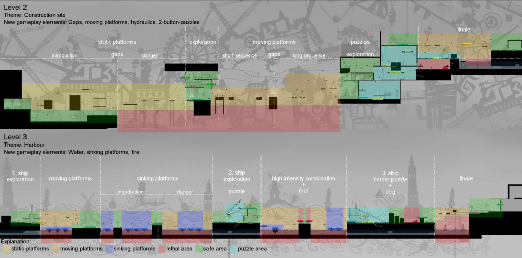
A Pacing Analysis of my Levels
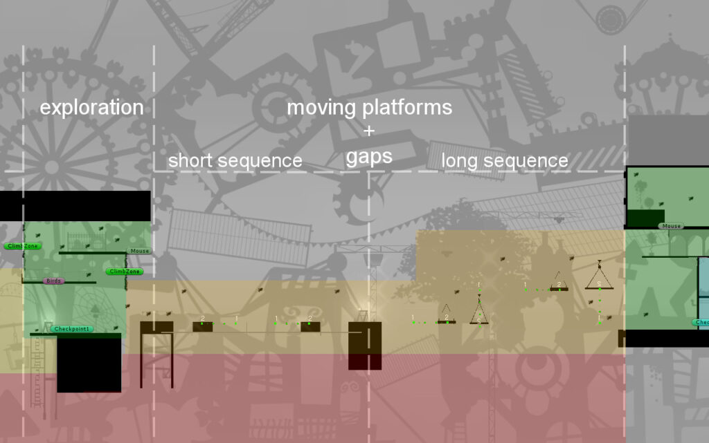
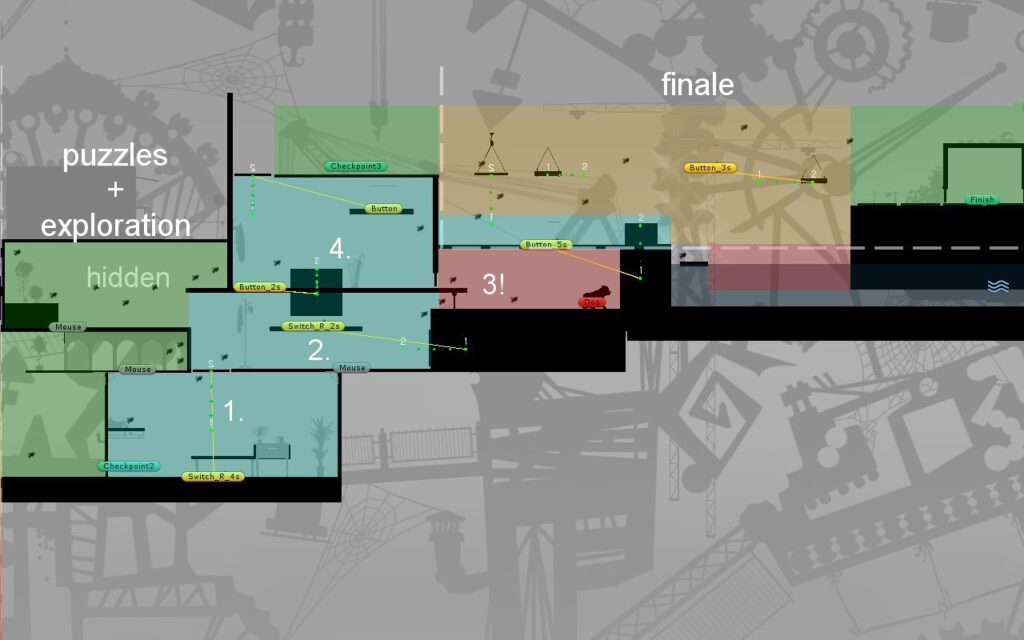
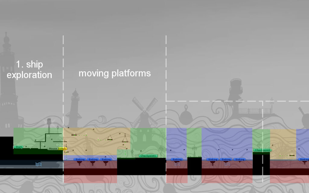
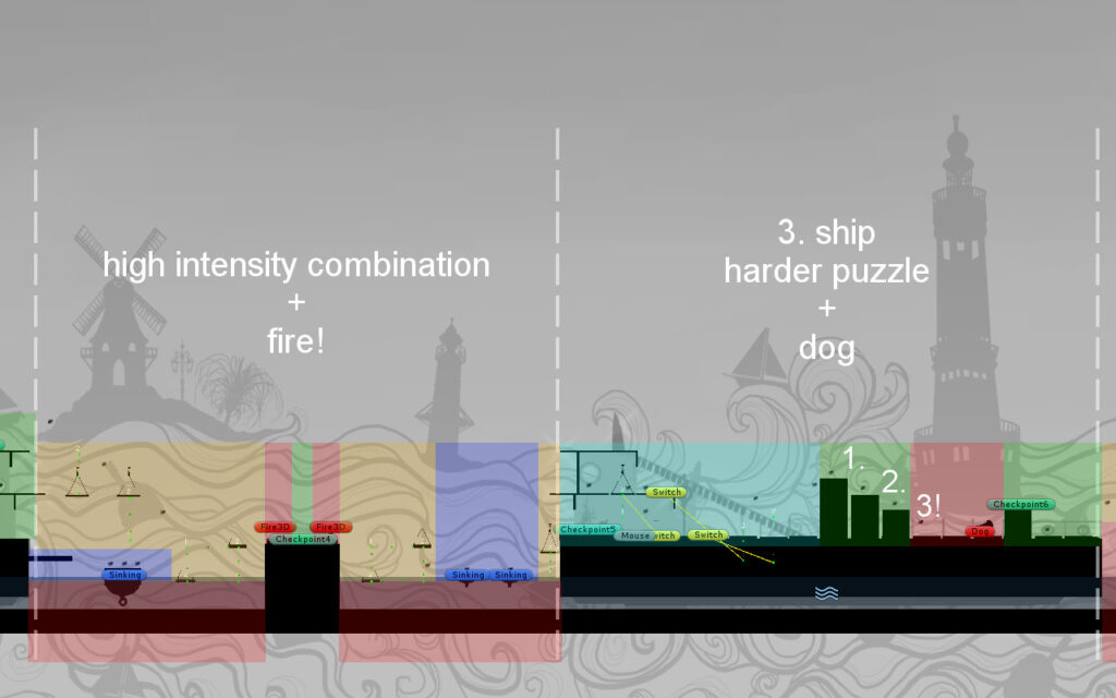
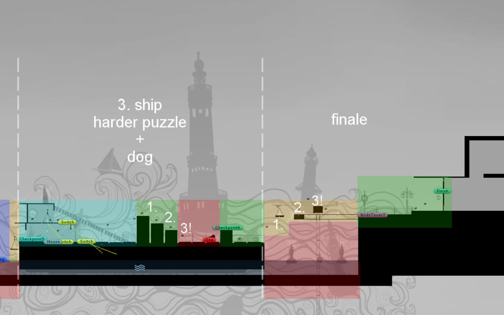
The following slides are an analysis on the pacing of the levels I created. They are intended to give some insights into the thought processes behind the design of my levels, as well as some of the gameplay features.
These screenshots have been made within the Unity3D Editor with the actual level geometry highlighted.
Gameplay irrelevant elements and decorations are grayed out, rooms are uncovered and gameplay elements labeled. Some of these black boxes are only visible in the editor (Unity3D) and then hidden during gameplay, to help us Level Designers while creating the levels. The white text and a color coded overlay have been added with Gimp. (Except for the tiny dots and numbers that indicate way-points for moving platforms. These are part of our generated debug visuals.)
While I did not plan the levels in such a detailed fashion as in this analysis, we planed the distribution and introduction of gameplay elements over the course of the 4 levels. I also created bubble diagrams to plan out in which sequence to introduce and use these gameplay elements in each of my levels. These diagrams already contained sections of exploration to facilitate good pacing.
Development Process
First Project Semester
I joined the project in the 4th semester, where we still had a lot of other courses alongside it. Still our group had already created our first prototype for another game (It’s mine) in 4 weeks and we were eager to continue our work as a group with CatWalk.
We started out with a mostly graphical concepts and a few vague game-play elements that had to be refined, prioritized, prototyped and then iterated on or dropped. For the first 2 months, I was responsible for setting up the scripting for a first working prototype in Unity.
With this prototype we tested out different gameplay elements and level design workflows. Our first semester was still heavily focused on getting the basic gameplay up and running, while struggling with PhysX, and we finished it with one level that we had worked on collaboratively and all the basic gameplay finished, but still rather rough. The cat could walk, run, jump in 3 different ways (normal, high and far) and grab edges and pull itself up.
Second Project Semester
Reflecting on the feedback from our final presentation in the previous semester as well as play tests, we decided to streamline the gameplay, to make it and the cat’s movements more elegant. Therefore we gave the cat one movement speed, a quick trot somewhere between walking and running and only one way to jump. I set up a system of raycasts to adjust the jump length and hight in some situations. These handled otherwise awkwardly clumsy jumps against walls that have a reachable edge, as well as abruptly stopping the jump in midair to grab an edge. These also allowed for a smoother and more precise jump when catching mice.
While we had a small interior and the basic uncovering technique for rooms in our last semester prototype, we decided to expand on the interiors. For this I needed to expand on the technique behind the covers and add a room camera for more overview in some rooms. I also programmed and finetuned things for the general gaming experience. For example, our moving platforms needed an overhaul to ensure they would stay in sync. The GUI needed some love and expansion, a menu and level finished screen. Level loading needed to be optimized for web and performance in general needed optimization.
We added Gameplay elements like buttons, water, fire, climbing and dogs. Tested and refined them. We even redid the entire animation for the cat in flash, to make it smoother than the frame by frame approach before could have ever had in a reasonable time frame.
The Final Stretch – 4 Levels in 4 Weeks
Near the end of the semester we had one, big, awkward patchwork of a level that had just always been extended upward in a zig-zag fashion. It eventually got cut into pieces by me, to try having it loaded in smaller chunks rather than a big, singular one, to optimize for the webplayer. That’s when Cordula stepped up and had us all consider to just dump that monster and do a complete overhaul for the levels.
And we did. About 4 weeks before the final presentation. We isolated the few parts we really liked and saved them, then started over and integrated them into the 4 final levels that are now in the game. We Level Designers decided to make 4 Levels. We created the list of Gameplay elements we wanted to include, specifying in which levels they were supposed to be introduced and used. We settled for general themes with our Artists and let them detail the list of assets needed to populate these as they saw fit, only requesting small things and adjustments.
We split the 4 Levels between us, leaving Cordula with the first and the last one, and me with the two in the middle. I created some quick bubble diagrams for my levels, about as detailed as the descriptive area titles in the analysis above. I then blocked out my levels using only the black boxes (as seen in the analysis) and completed it with all the gameplay elements. While switching between our levels as we worked on them, our Artists placed assets in the levels that we Level Designers didn’t currently work on.
This workflow and all the gameplay elements and tools we had created beforehand enabled us to make the deadline and create 4 levels in 4 weeks. Even though we knew we could make it, our coaches never saw that one coming 😉
Credits
Anja Golisch:
2D Animation
Concept Art
2D Design
Cordula Guder:
Level Design
Game Design
Scripting
2D Animation
Sound&Music
Mandy Schmidt:
2D Design
Concept Art
3D Design
Particle Systems
Martin Schmitz:
Level Design
Game Design
Scripting
Special thanks goes to our coaches Prof. Thomas Bremer, Prof. Claus Wohlgemuth, and Susanne Brandhorst for their feedback and advice.
I’d also like to thank Sophie Guder for her help in creating the music for the game.










Leave a Comment